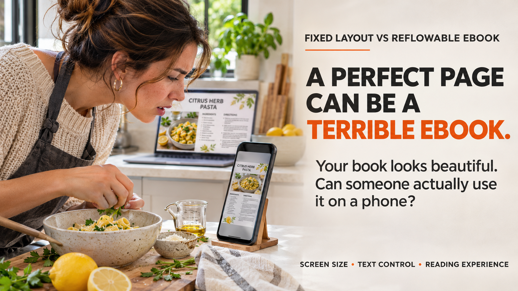
The cookbook looks perfect on a laptop. Every photograph sits beside its recipe, the captions line up, and the page breaks are just right. Then the author opens the ebook on a phone. A photo moves, a heading lands on the next screen, and the recipe no longer looks like the printed page.
That can be a formatting mistake. It can also be normal behavior in a reflowable ebook. The real question is whether the design needs to remain identical or whether the words need room to adapt to each reader's screen.
For authors weighing fixed layout vs reflowable ebook, the smartest choice is the one that protects the reading experience, not the appearance of a manuscript in Word or PDF. The team at Amazon KDP Experts works with authors preparing different kinds of books for digital and print publication, where this decision belongs early in production, not after the files fail a preview.
Key Takeaways
- Choose reflowable for most novels, memoirs, and text-led nonfiction. Readers can usually adjust the size and presentation of the text.
- Consider fixed layout when the precise relationship between words and images carries meaning, as in picture books and some comics.
- Do not confuse fixed-layout EPUB with Kindle Print Replica. The formats and device limitations are not interchangeable.
- Test the actual reading experience before approving an ebook file, especially on smaller screens and with accessibility tools.
Fixed Layout vs Reflowable eBook: What Is the Difference?
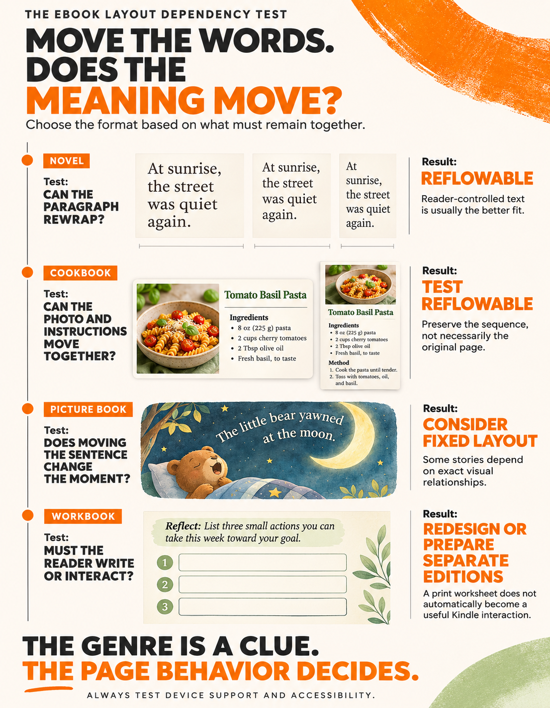
A reflowable ebook lets text move to fit the device and the reader's font settings. A fixed-layout ebook keeps text and images in designated positions on each page. Reflowable works best when words matter more than exact page design; fixed layout makes sense when moving the design would change how the content is understood.
Think of reflowable as water poured into different glasses. It changes shape without changing what it is. Fixed layout is more like a framed illustration: the relationship between its parts is the point.
Neither is automatically the premium choice. A beautifully designed fixed page can be frustrating when its tiny type is squeezed onto a phone. A reflowable novel might look less controlled from one device to another, yet feel far better to read.
How Does a Reflowable eBook Work?
In a reflowable EPUB or Kindle ebook, the reading app lays out the text again when a reader changes the font size, screen orientation, or available viewing area. Paragraphs move, images typically stay anchored within the content, and what counted as one screen of text may become several.
That is why a reflowable ebook should not depend on a sentence always appearing at the bottom of a particular page. Fixed headers, decorative page numbers, carefully spaced blank lines, and text boxes carried over from a paperback can become distractions or break the flow entirely.
Books that usually benefit from reflowable formatting
Novels, memoirs, biographies, business books, self-help titles, essays, and text-led nonfiction generally belong here. So do many books containing photographs, charts, or tables, provided the elements can be placed near the relevant text without losing context.
For example, a gardening guide may use a photograph between paragraphs to show a pruning technique. If the photo can move with its caption and the instructions still make sense, a reflowable edition may work well.
Why reader controls matter
Readers often adjust their ebooks rather than accept the publisher's original typography. BookNet Canada's Canadian Leisure & Reading Study 2025 reported that 75% of the surveyed ebook readers at least sometimes adjusted font size or spacing. The finding concerns adult, English-speaking Canadian respondents, not all global ebook readers, but it illustrates a real expectation: readers want control over how text appears.
Reflowable structure is also generally friendlier to text-to-speech, screen readers, and refreshable braille devices when the content is properly marked up. Accessible production still requires meaningful heading structure, a sensible reading order, useful image descriptions, and working navigation. Simply saving a file as EPUB does not make it accessible.
When Does Fixed Layout Make More Sense?
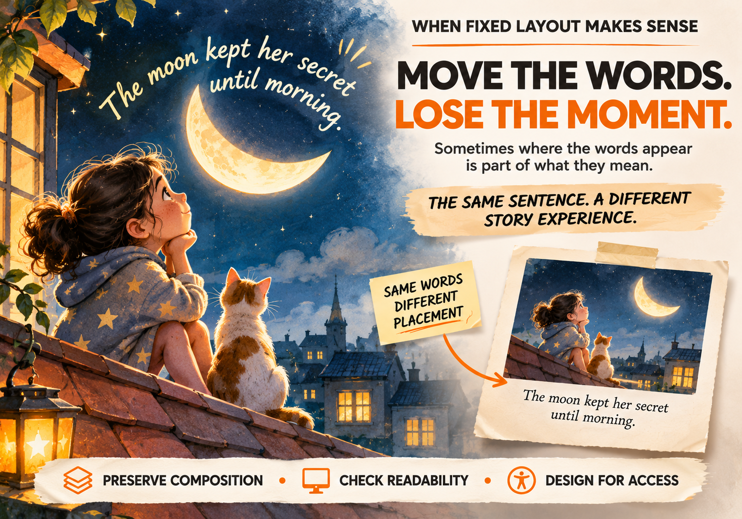
Fixed-layout EPUB holds page elements in defined positions. It is useful when an illustration and its words must be understood together or when a panel sequence, diagram, or visual arrangement is part of the storytelling.
Consider a children's picture book where a sentence curls around the moon above a character's head. Move the sentence beneath the illustration and the page loses some of its timing and charm. Keeping the relationship intact may justify fixed layout.
Good candidates for fixed layout
- Picture books whose text placement is part of each illustration.
- Comics and graphic novels where panels need a controlled sequence.
- Art and photography books built around deliberate compositions.
- Some instructional titles where labels, arrows, and diagrams cannot be separated without confusing the explanation.
A cookbook or workbook is not automatically fixed layout. A cookbook with ordinary recipes and photos can often use reflowable formatting. A cookbook with tightly arranged ingredient diagrams, annotated images, or intricate spreads may need a fixed approach. The content, not the genre label, should make the decision.
The accessibility trade-off
Fixed layout can preserve visual storytelling, but readers may have fewer options to resize type, change fonts, or use assistive technology. Some fixed-layout techniques provide text pop-ups or panel-by-panel viewing; support depends on the Kindle format and device. Image-based pages can also hide text from a screen reader unless accessible alternatives are built with care.
The decision should therefore be: Can we preserve the page's meaning while giving the reader enough ways to access it? If that answer is no, reconsider the design or the delivery format.
Reflowable vs Fixed Layout: A Side-by-Side Comparison
| What matters | Reflowable ebook | Fixed-layout ebook |
|---|---|---|
| Page appearance | Changes to fit screens and reader settings | Maintains a designed page arrangement |
| Text size | Usually adjustable | Usually restricted; some formats offer pop-ups or zoom |
| Best fit | Novels and text-led nonfiction | Picture books, comics, and layout-dependent content |
| Images | Flow with nearby content when correctly anchored | Stay in chosen positions relative to the page |
| Reading devices | Broad compatibility for standard Kindle reading | Support depends on the specific fixed-layout method |
| Accessibility | More flexible when semantically structured | Requires extra care; some options have major limitations |
| Production work | Focus on clean structure and responsive behavior | Focus on page design, text alternatives, and device tests |
| Common mistake | Trying to force print-style page breaks | Shrinking a full page until the text becomes unreadable |
Where Kindle Print Replica fits
Print Replica is not another name for every fixed-layout EPUB. It is a Kindle format that retains the appearance of an existing print page, typically created from a PDF workflow. It may suit some complex textbooks or reference works when exact page composition is essential.
But it has a serious trade-off: it is not compatible with Kindle e-reader devices, and readers do not receive key options such as ordinary text resizing or screen-reader support. Kindle also has distinct fixed-layout methods, including text pop-ups, image pop-ups, and virtual panels. Their device support and features differ.
Amazon's own Kindle format comparison gives the guiding rule:
“Only use Print Replica format when your content absolutely requires maintaining exact print layout and cannot be effectively converted to a more accessible format.”
That is a useful standard even when an author is not using Print Replica: do not lock the page unless the content needs to be locked.
Which Format Fits a Novel, Children's Book, Cookbook, or Workbook?
Novels and memoirs: let the text move
The reader should be able to enlarge a passage without breaking dialogue, headings, or chapter navigation. Reflowable is usually the sensible default. If the print edition has decorative page numbers or headers, leave those out of the ordinary digital reading flow.
Children's picture books: preserve meaningful composition
If the illustration tells half the story and words are placed to support the action, fixed layout may be appropriate. Test the type size and any pop-up or guided reading feature on the intended devices. Do not assume that beautiful full-page illustrations automatically create an accessible book.
Cookbooks and instructional books: test a sample first
Try converting a representative recipe that contains a photo, ingredient list, method, and caption. If the order remains clear on a small screen, reflowable may be enough. If labels need to line up precisely with parts of a diagram, a fixed approach deserves testing.
Workbooks: separate reading from writing
An exercise book may be simple to read digitally but awkward to complete in an ordinary Kindle app. Decide whether customers are meant to read instructions, type answers, write by hand on paper, or interact with an external resource. A print workbook and an ebook edition may need different designs, rather than one converted file pretending to do both jobs.
A Real-World Case Study: When the Layout Was Part of the Story
Italian publisher Edizioni Sonda worked with accessibility organization Fondazione LIA on a digital edition of E tu cos'hai di speciale, an illustrated children's book by Horst Klein and Monika Osberghaus. The team determined that converting the pages into a reflowable format would weaken the relationship between the illustrations and the text.
Their solution was not to abandon accessibility. They developed a fixed-layout EPUB, assessed reading order, added meaningful alternative text for images, improved color contrast, and reworked aspects of the document's structure. According to Fondazione LIA's project report, the result passed EPUBCheck and Ace by DAISY checks and met the project's stated WCAG conformance target.
The result came with an important qualification: the fixed layout still could not provide the same flexible reading presentation as a reflowable ebook. The project demonstrates that fixed layout can be the right editorial choice, but it requires deliberate accessibility work rather than exporting every print page as an image.
The lesson for a self-publishing author is not that every picture book needs the same technical process. It is that visual fidelity and accessibility should be considered together, before the final files are approved.
A Familiar Author Scenario: The Cookbook That Looked Fine Only on a Laptop
Imagine a first-time author with a cookbook prepared as a beautiful print PDF. Each recipe has a large photo on the left and instructions on the right. The author asks for an ebook that looks exactly the same.
On a tablet, the spread may be attractive. On a phone, the ingredient list becomes difficult to read without repeated zooming. Converting that PDF into a rigid ebook would preserve the design but create a poor reading experience for someone following a recipe in a kitchen.
The better answer may be to create two different interiors: a fixed print PDF and a reflowable ebook with the photo above the ingredients, followed by the method. If a particular illustrated technique truly needs an exact arrangement, it can be reconsidered separately. This is a hypothetical scenario, not a claimed client result.
How to Choose the Right eBook Layout Before Production
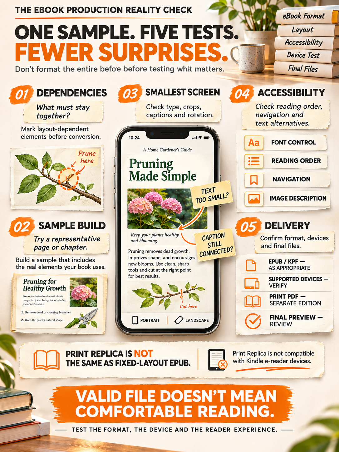
Use this practical five-step check before paying for conversion or approving a Kindle file.
- Mark the layout-dependent pages. Identify every spread where moving an image, label, or text box would change meaning. Do not mark a page merely because the designer likes its appearance.
- Build one sample in each plausible format. A chapter, recipe, or illustrated spread is usually enough to expose the main trade-offs before the whole book is formatted.
- Test the smallest realistic screen. Look for tiny type, awkward crops, broken captions, and sequences that stop making sense when the device rotates.
- Test reader controls and accessibility. Try changing font size, moving through the contents, checking reading order, and reviewing image descriptions. Verify the features supported by the intended format.
- Confirm the platform and deliverables. Ask what will be submitted to KDP, whether EPUB or KPF is suitable, which devices are supported, and whether the print edition requires its own PDF.
For print-specific preparation, the existing guide to formatting a book in Word for KDP covers page setup and paperback requirements. Those print controls are not instructions for forcing an ordinary ebook into fixed pages.
What Most Authors Get Wrong: Do This, Not That
Do this: Choose layout based on how readers need to use the content.
Not that: Choose fixed layout because it looks more like the printed book.
Do this: Keep captions attached to the correct images in a reflowable file.
Not that: Add blank lines and spaces until the page looks right in one preview.
Do this: Test accessibility and device support before approving a fixed-layout edition.
Not that: Assume every Kindle or reading app supports every fixed-layout feature.
Do this: Prepare separate digital and print files when their needs differ.
Not that: Upload the paperback PDF as though it were automatically the best Kindle ebook.
Do this: Review how the actual file behaves after conversion.
Not that: Treat a clean EPUB validation report as proof that the book is pleasant to read.
For a broader view of edition-specific file preparation, see the published KDP formatting requirements checklist. It covers the production rules that sit alongside this layout decision.
What Should an Author Ask a Professional eBook Formatter?
Ask which layout the formatter recommends and why. The answer should refer to sample pages, reader controls, intended devices, image handling, and the files that will be delivered, not simply a promise that the ebook will look identical everywhere.
Authors can request a review through the site's book formatting services if they need help preparing edition-specific interiors. If the book files are already approved but upload readiness, metadata, and KDP submission are the main concerns, publishing support may be the better fit.
In either case, retain the approved manuscript and confirm exactly which formats and revisions the agreement covers. Professional formatting can improve file quality and reader experience; it cannot guarantee approval, compatibility with every device, or book sales.
Final Thoughts: Protect the Reading Experience, Not the Page Number
The debate over fixed layout vs reflowable ebook becomes easier when an author stops asking, “How do I keep every page exactly the same?” and starts asking, “What must stay together for this book to make sense?”
For most text-first books, reflowable gives readers the freedom they expect. For a picture book or graphic work where the arrangement carries the story, fixed layout can be justified. Print Replica belongs in an even narrower decision and should never be treated as the default shortcut.
Choose the format through an actual sample, test the devices that matter, and make accessibility part of the discussion from the beginning. The best ebook is not the one that wins a screenshot comparison. It is the one readers can comfortably use.